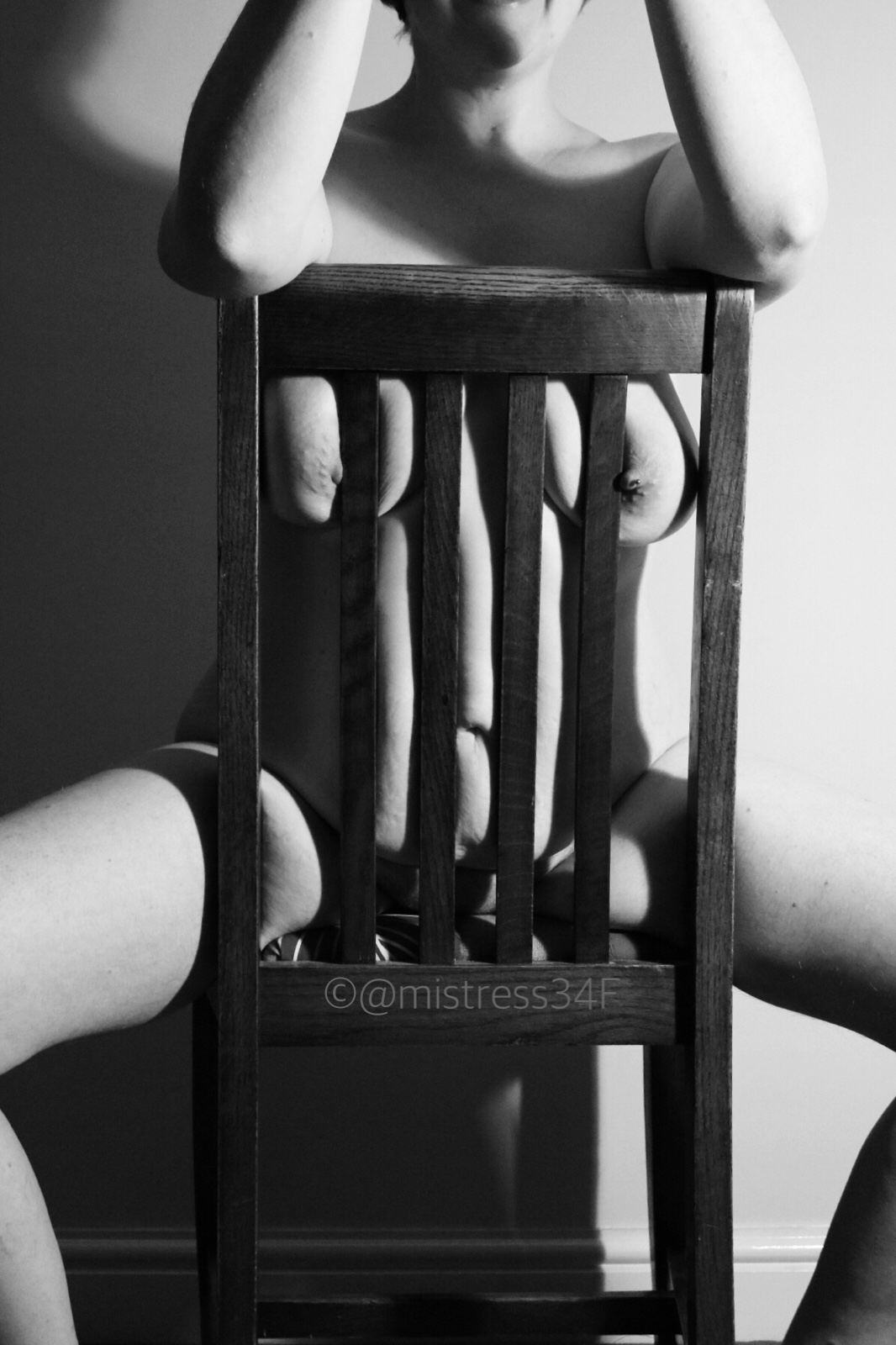
Whenever I mention to others online or in real life that I need some inspirations for an image the comment “on a chair” always comes up. So here are two images for those people.
I took several on this chair one evening and I can’t decide on my favourite of the two. I think I prefer the top of the first image and the bottom half of the second. Let me know your opinions.


I love the bottom image and how your nips appear to be trying to converse with each other lol.x
I much prefer the top image because you look more comfortable and relaxed in it giving the impression we have caught you in a candid moment. In the second one, which is lovely, it feels more forced/performative, if that makes sense
Mollyx
My gut said first too …. but I like asking others for their opinion. It’s not always the same as mine!
Yes I completely agree and also I have found that it often ends up with me seeing the image(s) in a new light
Mollyx
I think both images are equally as stunning, I love the string contrasts of tone and the contrast of the softness of your body and the hard structure of the chair. Gorgeous.
Not sure, I’ll need to study them at length, should I rephrase that? I do love the way your tits are pressed against the bars, and your nipples are projecting through it.
Top one for me. It’s a great image and I love the way your breasts and thighs are pressed against the hard wood. Very sexy!
Indie xx
Both images are fab – love chair images too – used them quite a few times in different ways – your nipples look great x
The top is my favorite, but they’re all gorgeous. The shadows made my chair had really interesting contrast, too.
This is a fabulous idea for photos. I love how your nipples are peaking through 😉
Rebel xox
Both are lovely but I must admit I am drawn more to the second. It looks to me like your boobs are thrust further forward, with a hint of come and get me, which makes your lower half look further out of reach, which suggests a wonderful level of tease to me. You did a fab job including the chair though. I’ve tried one as a prop myself but never felt happy with the results x
After extensive careful study, I think the first, because I like the hint of smile. I prefer the shadow on your arm in the second, however.
Like I said on twitter last night, I like the top one the best, but they’re both beautiful. Xx
Thank you x
Lovely, Missy – taking Christine Keeler to the next level! Slats, shadow, stripes and mono is always a great way of creating an arresting image. Gorgeous x
I like both a lot but I’m partial to the first one.
Glorious teasing glimpses of your body. I particularly like how your nipples just about peek out. The top one edges it for me.
O x
I would say the top image, as I love the hint of the smile on you. You look more relaxed, and I think it makes the whole image ‘work’ better.
But overall the effect in both is stunning, so not an easy choice! xx
The shadows in these are ace! I like the top photo better because of your smile! x
Lovely images, both, with slightly different feels, the top being more relaxed.
I think they’re both amazing but I prefer the first one a
Though I can’t put my finger on what it is.
I have to agree with your choices, certainly worth posting both pics. Your top and bottom look amazing in both photos. Love the black and white, too.
I love both. They are so artistic and professional looking, not to mention how stunning your body looks through and around the chair. Very sensual ?
The thumbnail image really stood out on the links. Great pic x